How to Build a Landing Page for Digital Products That Converts

A well-designed landing page can be the difference between a visitor clicking away or becoming a loyal customer. For digital products, your landing page serves as the first impression and, in many cases, the deciding factor for whether a potential buyer trusts your product enough to make a purchase.
This guide will walk you through how to build a landing page that not only looks incredible but also converts. By the time you finish reading, you’ll know the key components of a high-performing landing page, common mistakes to avoid, and tips for improving your page’s effectiveness.
Why Your Digital Product Needs a Landing Page
If you’re thinking, “Can’t I just send people to my website’s homepage?” the answer is simple: not if conversions are your goal. While your website might serve as the central hub for your brand, a landing page is a targeted tool that focuses on one purpose—to encourage visitors to take a specific action. For digital products, this might mean signing up for a subscription, downloading an app, or buying an online course.
Here’s why a dedicated landing page matters for digital products:
- Focuses on a single call to action (CTA): Unlike a homepage, a landing page eliminates distractions by narrowing in on one actionable goal.
- Communicates value quickly: You only have a few seconds to grab attention. A landing page lets you showcase your product’s benefits in a streamlined way.
- Boosts conversions: Studies show that well-designed landing pages can increase conversion rates by up to 300%.
Now, let’s get into the mechanics of crafting such a page.
Building Blocks of a High-Converting Landing Page
Headline That Grabs Attention
The headline is the first thing visitors see, so it needs to be powerful and clear. A good headline:
- Directly addresses the visitor’s pain point or desire.
- Highlights the unique benefit of your product.
- Is short and easy to understand.
Example: Instead of “Revolutionize Your Workflow,” try something more specific like, “Save 10+ Hours a Week with [Your Digital Product].”
Subheading That Supports the Headline
While your headline catches attention, the subheading backs it up with value. Use this section to provide a key detail or expand on what makes your product special.
Example: “Our all-in-one project management tool helps teams of any size stay organized and hit deadlines effortlessly.”
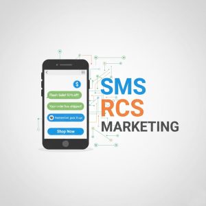
Visuals That Tell a Story
Digital products often rely on visuals to make an impact. Whether it’s screenshots of your product, customer testimonials, or engaging graphics, visuals help:
- Show your product in action.
- Create emotional appeal.
- Break up large sections of text.
Design Tip: Keep visuals clean and professional. Tools like Canva or Figma can help you create high-quality graphics, even if you’re not a designer.
Compelling Value Proposition
Your value proposition is the core reason someone should choose your digital product over competitors. Write it in a way that makes the problem you solve feel urgent and your solution feel irresistible.
Formula: [Problem] + [Your Solution] = [Clear Benefit]
Example: “Managing multiple social media accounts is overwhelming. With [Product Name], you can schedule 50 posts in under 10 minutes, saving you both time and headaches.”
Benefits Over Features
While features are important, benefits speak to your audience’s emotions and needs. Instead of what your product does, focus on how it makes your customer’s life easier.
Features Tell, Benefits Sell.
- Feature: 24/7 customer support.
- Benefit: Never worry about being stuck with an issue—we’re here any time you need help.
Social Proof for Credibility
Humans are naturally influenced by other people’s opinions. Add testimonials, reviews, or user statistics to build trust.
Examples of Social Proof to Include:
- Customer testimonials (ideally with photos/names for authenticity).
- Logos from companies using your product.
- Awards, media features, or public endorsements.
Example: “Trusted by over 5,000 marketers at companies like [Well-known Brand 1] and [Well-known Brand 2].”
Strong Call to Action (CTA)
Your CTA should guide users on exactly what to do next. Great CTAs are:
- Clear and action-oriented (“Start Your Free Trial,” “Download the App Now”).
- Visually distinct with buttons or bold text.
- Positioned strategically throughout the page—not just at the bottom.
Pro Tip: Use urgency to encourage immediate action. For example, “Sign up today to get an exclusive launch discount!”
Mobile-Friendly Design
With over 50% of web traffic coming from mobile devices, your landing page must deliver a seamless experience on all screen sizes. Ensure:
- Text is readable without zooming.
- Buttons are large enough to tap easily.
- Loading speed is fast (use tools like Google PageSpeed Insights to test).
Optimize for SEO
While a landing page is often part of paid marketing campaigns, optimizing it for search engines is still important to drive organic traffic. Use keywords naturally in your:
- Headline and subheadings.
- Meta title and description.
- Alt text for images.
For this blog, target keywords like “landing page for digital products” and “how to build a landing page” to help your ranking.
Common Mistakes to Avoid
Learning what to avoid is just as valuable as knowing what to do. Watch out for these pitfalls:
- Too much information: Avoid overwhelming visitors. Keep your content concise and relevant.
- Unclear CTA: If your CTA is vague (e.g., “Click here”), users won’t know what to expect.
- Distracting design: Don’t overwhelm the page with multiple fonts, clashing colors, or excessive animations.
- No social proof or trust signals: Without credibility, users may hesitate to take action.
By steering clear of these mistakes, you’ll be able to keep visitors engaged and focused on converting.
Tips for Testing and Improving Your Landing Page
After launching your landing page, the work doesn’t stop there. Testing is key to improvement. Use A/B testing to:
- Compare headlines and CTAs.
- Test button colors and placements.
- Experiment with different layouts.
Track metrics like conversion rate, time spent on the page, and click-through rate to evaluate your page’s performance.
Tools for Testing:
- Google Optimize
- Crazy Egg
- Hotjar
Elevate Your Digital Product With a Better Landing Page
Building a landing page for digital products might seem intimidating at first, but the payoff is worth it. By combining compelling copy, engaging visuals, and a laser-focused CTA, you’ll create a powerful tool that boosts conversions and grows your business.
Now it’s your turn. Start building your landing page today with these tools and tips in mind. And remember, always prioritize your audience’s needs by making the page clear, easy to use, and packed with value.
Need expert help refining your message? Tools like Outwrite can help ensure your copy is polished and persuasive. Try it for free and see the difference.