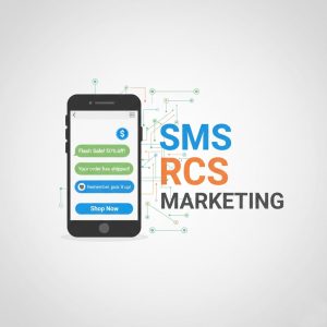
Why Your Next Campaign Must Be Mobile-First
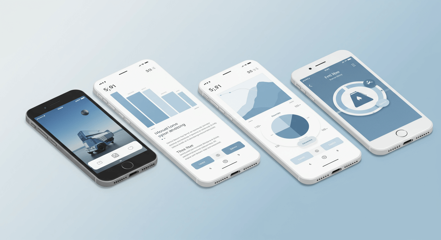
A mobile-friendly campaign prioritizes user experience on smartphones and tablets, using responsive design, fast loading speeds, simple navigation, scannable content, and optimized forms. By creating seamless, engaging experiences, brands can capture attention, boost conversions, and strengthen customer relationships. Mobile-first strategies are essential in today’s device-driven world.
How often do you check your phone each day? If you’re like most people, the answer is probably “a lot.” In fact, recent data shows that mobile devices account for over half of all web traffic worldwide. This shift in user behavior isn’t just a trend; it’s the new standard. For marketers, this means that if your campaigns aren’t designed for mobile users, you’re missing out on a massive segment of your audience.
Creating a successful mobile-friendly campaign goes beyond simply shrinking your desktop content to fit a smaller screen. It requires a strategic, mobile-first approach that prioritizes the user experience on smartphones and tablets. From design and copy to loading speed and navigation, every element must be optimized for on-the-go consumption.
What is a Mobile-Friendly Campaign?
A mobile-friendly campaign is a marketing initiative specifically designed to be viewed and engaged with on a mobile device, like a smartphone or tablet. This involves more than just responsive design that adjusts to different screen sizes. A truly mobile-friendly campaign considers the unique context of the mobile user. Learn more about Mobile Marketing Platforms.
These users are often multitasking, have shorter attention spans, and expect information quickly and easily. Therefore, a mobile-friendly campaign features:
- Responsive Design: Layouts that automatically adapt to any screen size.
- Fast Loading Speeds: Pages and content that load in three seconds or less.
- Simple Navigation: Clear menus and large, “thumb-friendly” buttons.
- Concise Content: Short paragraphs, scannable text, and impactful visuals.
- Optimized Forms: Simple forms with minimal fields that are easy to fill out on a small screen.
By focusing on these elements, you create a seamless and enjoyable experience that encourages users to interact with your brand instead of navigating away in frustration.
Key Elements of a Mobile-Friendly Campaign
To build a campaign that truly connects with a mobile audience, you need to focus on several core components. Here’s a breakdown of what matters most.
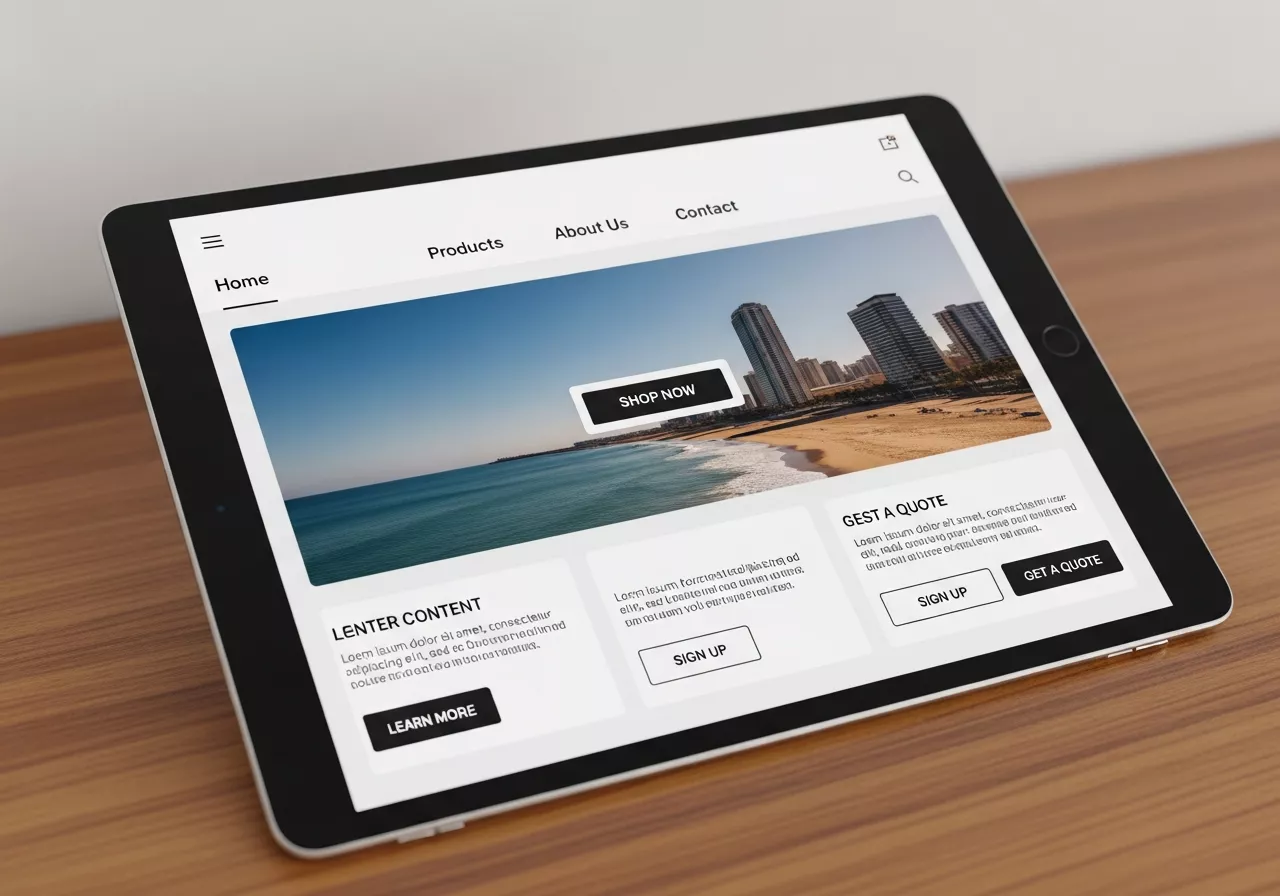
Responsive Design for All Devices
Responsive design is the foundation of any mobile-friendly strategy. It ensures your website, landing pages, and emails look and function perfectly, no matter the device. A responsive layout automatically adjusts text, images, and navigation menus to fit the screen, providing a consistent experience for everyone.
Why it matters:
- Improved User Experience: Visitors don’t have to pinch, zoom, or scroll horizontally to view your content.
- Better SEO: Google favours mobile-friendly websites, which can improve your search engine rankings.
- Increased Conversions: A seamless experience makes it easier for users to complete desired actions, like making a purchase or filling out a form.
Optimize for Page Speed
Mobile users are impatient. According to Google, 53% of mobile site visitors will leave a page that takes longer than three seconds to load. Slow loading times can kill your conversion rates and damage your brand’s reputation.
How to improve speed:
Compress Images:
Use tools like TinyPNG or ImageOptim to reduce the file size of your images without sacrificing quality. Large images are one of the biggest causes of slow loading times, especially on mobile devices. By compressing your visuals, you maintain the same appearance while dramatically improving performance. Make image compression a regular part of your workflow to ensure that every new upload is optimized from the start.
Minimize Code:
Remove unnecessary characters, spaces, and comments from your HTML, CSS, and JavaScript files. Clean, streamlined code loads faster and performs better across devices. Techniques like minification and combining files (where appropriate) help reduce server requests and browser processing time. Even small improvements in code efficiency can have a noticeable impact on how quickly your site loads.
Leverage Browser Caching:
Configure your server to store parts of your website in a user’s browser, so it loads faster on subsequent visits. When elements like images, stylesheets, and scripts are cached, users don’t need to download them again each time they visit your site. Setting an appropriate cache duration for static files ensures returning visitors experience significantly faster load times with minimal bandwidth usage.
Use a Content Delivery Network (CDN):
A CDN stores copies of your site on servers around the world, delivering content from the server closest to the user for faster access. This reduces latency, improves page load speed globally, and creates a smoother experience for users regardless of their location. Pairing a CDN with image compression and caching can dramatically enhance your site’s performance, especially during high traffic periods.
Simplify Navigation and Calls to Action
Navigating a complex website on a small screen is frustrating. Your mobile campaign should feature simple, intuitive navigation that helps users find what they need quickly.
Best practices for mobile navigation:
- Use a Hamburger Menu:
This common icon (three horizontal lines) saves screen space while keeping your navigation accessible. It allows users to open and close the menu effortlessly, maintaining a clean and uncluttered layout. On smaller screens, this design helps prioritize essential content without overwhelming visitors. - Keep it Simple:
Limit the number of items in your main menu to only the most essential pages. A simplified structure prevents confusion and reduces cognitive load, allowing users to find what they need quickly. The fewer choices you present, the faster and more intuitive the navigation becomes. - Make Buttons Thumb-Friendly:
Ensure that buttons and links are large enough to be easily tapped with a thumb without accidentally hitting something else. Apple recommends a minimum target size of 44×44 pixels. Adequate spacing between elements also improves accessibility and reduces frustration, especially for users browsing on smaller devices. - Clear CTAs:
Your call-to-action buttons should be prominent, with clear, action-oriented text like “Shop Now,” “Learn More,” or “Sign Up Free.” Strong CTAs guide users toward the next step and help increase conversions. By placing them in noticeable positions and using contrasting styles, you ensure they stand out on mobile screens.
Craft Scannable Content
People rarely read every word on a mobile screen. Instead, they scan for key information. Your content needs to be structured in a way that makes it easy for them to grasp the main points quickly.
How to create scannable content:
- Use Short Paragraphs:
Break up long blocks of text into smaller, digestible paragraphs. Short paragraphs make it easier for readers—especially mobile users—to absorb information quickly without feeling overwhelmed. Aim for 1–3 sentences per paragraph to maintain a smooth, easy flow. - Write Clear Headings:
Use descriptive H2 and H3 headings to organize your content and guide the reader. Strong headings act as visual anchors, helping users scan through the page and locate the information they need instantly. Clear section titles also improve SEO by signaling content structure to search engines. - Incorporate Bullet Points:
Lists are an excellent way to present information in a scannable format. Bullet points help break down complex ideas into simple, readable chunks, making your content more user-friendly. They also improve visual hierarchy, allowing readers to get the key takeaways at a glance.
Bold Key Phrases:
Highlight the most important information to draw the reader’s eye. Strategic bolding emphasizes essential ideas, makes your content more engaging, and helps users quickly identify the main points. This is especially effective for readers who skim rather than read word-for-word. In addition, bolding helps create visual contrast on the page, making your content easier to navigate. When used wisely, it guides attention to critical messages, supports readability on mobile screens, and reinforces the flow of your overall content.
Examples of Excellent Mobile-Friendly Campaigns
Let’s look at a few brands that excel at mobile marketing.
- Starbucks: The Starbucks app is a masterclass in mobile-friendly design. It allows users to order ahead, pay with their phone, and collect rewards seamlessly. The interface is clean, the buttons are large, and the entire process is designed for a user on the move.
- Nike: Nike’s website and marketing emails are perfectly optimized for mobile. They use high-impact visuals, minimal text, and clear calls to action. The product pages are easy to navigate, and the checkout process is streamlined, reducing friction for mobile shoppers.
- Airbnb: The Airbnb mobile experience makes booking a stay effortless. The search filters are easy to use, property photos are displayed beautifully, and the “Book Now” process is simple and secure. They understand their users are often planning travel on the go and have designed their platform accordingly.
Building Your Mobile-First Future
As mobile devices continue to dominate how we access the internet, a mobile-first approach is no longer optional—it’s essential for survival and growth. Consumers increasingly rely on smartphones and tablets for shopping, research, communication, and entertainment, making mobile optimization critical for businesses that want to remain competitive. Ignoring mobile users can result in lost traffic, lower engagement, and missed revenue opportunities, as users quickly abandon sites or campaigns that are difficult to navigate on smaller screens.
By prioritizing responsive design, optimizing for speed, and creating clear, concise content, you can build campaigns that meet your audience where they are. Responsive design ensures that every element of your website, landing pages, and emails automatically adjusts to the device being used, providing a consistent, high-quality experience. Fast loading times are equally important; even small delays can frustrate users and increase bounce rates. Meanwhile, concise, scannable content ensures that your messages are absorbed quickly, catering to mobile users’ shorter attention spans and on-the-go lifestyles. Incorporating intuitive navigation, prominent calls-to-action, and simplified forms further enhances usability and encourages engagement, ultimately leading to higher conversion rates.
Start by auditing your current marketing efforts from a mobile perspective. Open your emails, visit your landing pages, and navigate your website on a smartphone. Is the experience seamless, or is it frustrating? Look for bottlenecks such as slow-loading pages, cluttered layouts, difficult-to-tap buttons, or content that requires excessive scrolling. Identify these friction points and systematically apply mobile-first strategies to address them. Consider testing elements like navigation menus, button placement, and form usability to ensure that every interaction is optimized for the user.
Use analytics and user behavior data to gain insights into how mobile visitors interact with your site. Tools like heatmaps, session recordings, and A/B testing can reveal pain points and opportunities for improvement. Iteratively refining your mobile experience based on real-world data ensures that campaigns remain effective and aligned with user expectations.
Creating a positive mobile experience is a direct investment in your customer relationships and your bottom line. Mobile-optimized campaigns not only improve engagement and satisfaction but also build brand credibility and trust. As more consumers rely on mobile devices to discover, evaluate, and purchase products, businesses that embrace a mobile-first mindset will be better positioned to capture attention, drive conversions, and achieve long-term growth in an increasingly mobile-driven world.
Conclusion:
In today’s digital landscape, a mobile-first approach is no longer optional—it’s essential. Mobile-friendly campaigns enhance user experience, increase engagement, and drive higher conversion rates by meeting audiences where they are. By focusing on responsive design, fast loading, intuitive navigation, and scannable content, brands can build stronger customer relationships and stay competitive in an increasingly mobile-driven world.
FAQ:
Q1: What is a mobile-friendly campaign?
A mobile-friendly campaign is a marketing initiative designed specifically for mobile devices, prioritizing responsive design, fast loading, simple navigation, and concise content to enhance user experience.
Q2: Why is responsive design important?
Responsive design ensures content automatically adjusts to any screen size, improving usability, SEO, and conversion rates.
Q3: How can I improve mobile page speed?
Compress images, minimize code, use browser caching, and leverage a Content Delivery Network (CDN) to reduce load times.
Q4: What makes content scannable for mobile users?
Use short paragraphs, clear headings, bullet points, and bold key phrases to help users quickly grasp important information.
Q5: Which brands excel in mobile-friendly campaigns?
Starbucks, Nike, and Airbnb provide seamless, fast, and intuitive mobile experiences that prioritize user convenience and engagement.
Q6: Why is mobile-first marketing essential?
With over half of web traffic from mobile devices, mobile-first strategies ensure accessibility, engagement, and higher conversion rates for today’s audience.