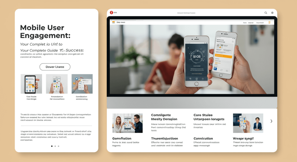
Mobile User Engagement: Your Complete Guide to Success
Mobile devices now account for over 60% of all web traffic worldwide, yet many businesses still struggle to keep mobile users engaged. The small screen real estate, shorter attention spans, and unique mobile behaviors create challenges that desktop-optimized strategies simply can’t address.
Mobile user engagement isn’t just about making your website mobile-friendly—it’s about understanding how people interact with content on their phones and tablets. When users engage meaningfully with your mobile experience, they’re more likely to convert, return, and recommend your brand to others.
Understanding Mobile User Behavior

Mobile users behave differently than their desktop counterparts. They’re often multitasking, have limited time, and expect instant results. Research shows that mobile users typically spend 69% less time reading content compared to desktop users, making every second count.
The context of mobile usage also differs significantly. Users might be commuting, waiting in line, or browsing during short breaks throughout their day. This means your mobile content needs to deliver value quickly and efficiently.
Mobile users are also more likely to abandon tasks if they encounter friction. A single extra step in your checkout process or a slow-loading page can mean the difference between a conversion and a lost customer.
Key Metrics for Mobile User Engagement
To improve mobile user engagement, you need to track the right metrics. Start with these essential indicators:
Session Duration measures how long users stay on your mobile site. While mobile sessions are typically shorter than desktop, unusually brief sessions may indicate usability issues or content that doesn’t resonate with mobile users.
Pages per Session reveals how deeply users explore your mobile content. A low number might suggest navigation problems or content that doesn’t encourage further browsing.
Bounce Rate shows the percentage of users who leave after viewing only one page. High mobile bounce rates often point to slow loading times, poor mobile optimization, or content that doesn’t match user expectations.
Time on Page helps identify which content keeps mobile users engaged longest. This metric is particularly valuable for optimizing your most important pages.
Conversion Rate ultimately determines whether your mobile engagement efforts translate into business results. Track micro-conversions (like email signups) alongside macro-conversions (like purchases) to get a complete picture.
Mobile-First Design Principles
Creating engaging mobile experiences starts with design. Mobile-first design means prioritizing the mobile experience from the ground up, rather than adapting a desktop design for smaller screens.
Thumb-Friendly Navigation ensures users can easily interact with your interface using one hand. Place important buttons and links within easy reach of the thumb, typically in the lower two-thirds of the screen.
Clear Visual Hierarchy becomes even more critical on mobile devices. Use size, color, and spacing to guide users’ attention to the most important elements. Your primary call-to-action should be immediately obvious.
Simplified Forms remove friction from the mobile experience. Ask only for essential information and use mobile-optimised input types (like number pads for phone numbers) to make form completion easier.
Readable Typography ensures your content is accessible on small screens. Use font sizes of at least 16px and maintain sufficient contrast between text and background colors.
Page Speed and Performance Optimization
Mobile users expect fast-loading pages, and search engines reward sites that deliver them. Google’s research shows that 53% of mobile users abandon sites that take longer than three seconds to load.
Image Optimization can dramatically improve mobile page speeds. Compress images without sacrificing quality and use modern formats like WebP when possible. Implement lazy loading to load images only when they appear in the user’s viewport.
Code Minification removes unnecessary characters from your HTML, CSS, and JavaScript files. This reduces file sizes and improves loading times without affecting functionality.
Caching Strategies store frequently accessed content on users’ devices, reducing the need to download the same resources repeatedly. Implement browser caching and consider using a Content Delivery Network (CDN) to serve content from locations closer to your users.
Server Response Time impacts how quickly your pages begin loading. Optimize your database queries, use efficient hosting solutions, and consider upgrading your server resources if response times consistently exceed 200 milliseconds.
Content Strategy for Mobile Users
Mobile content strategy requires rethinking how you present information. Mobile users scan content quickly, so structure becomes crucial for engagement.
Scannable Formatting helps users quickly find the information they need. Use bullet points, short paragraphs, and descriptive headings to break up text. White space becomes your ally in creating digestible content.
Front-Loaded Information puts the most important details at the beginning of your content. Mobile users might not scroll to the end, so lead with your key message or value proposition.
Mobile-Specific Content considers the unique context of mobile usage. Create content that’s useful for on-the-go users, such as store locators, quick how-to guides, or time-sensitive offers.
Interactive Elements can boost engagement when used thoughtfully. Consider adding polls, quizzes, or expandable sections that let users control their content experience.
Leveraging Mobile-Specific Features

Smartphones offer unique capabilities that desktop experiences can’t match. Smart businesses use these features to create more engaging mobile experiences.
Location Services enable personalized experiences based on where users are. Restaurants can show nearby locations, retail stores can offer in-store pickup options, and service businesses can adjust their messaging based on local conditions.
Push Notifications keep your brand top-of-mind between visits. However, use them strategically—irrelevant or too-frequent notifications quickly lead to uninstalls. Focus on genuinely valuable updates like order status, personalized recommendations, or time-sensitive offers.
Camera Integration can streamline user interactions. Consider features like barcode scanning for product information, augmented reality try-on experiences, or photo upload capabilities for customer service.
Touch Gestures create intuitive navigation options. Implement swipe gestures for image galleries, pull-to-refresh functionality, or pinch-to-zoom capabilities where appropriate.
Personalization and User Experience
Mobile personalization goes beyond simply using someone’s name. Effective personalization considers mobile-specific behaviors and preferences to create more relevant experiences.
Behavioral Targeting uses data about how users interact with your mobile site to customize their experience. Show different content to first-time visitors versus returning customers, or adjust your homepage based on previous browsing patterns.
Device-Specific Optimization recognizes that different mobile devices have different capabilities. Optimize experiences for various screen sizes, processing powers, and connection speeds.
Progressive Web App Features can make your mobile site feel more like a native app. Features like offline functionality, home screen installation, and app-like navigation can significantly boost engagement.
Testing and Optimization Strategies
Continuous testing helps you understand what engages your specific mobile audience. Different approaches work for different businesses, so data-driven decisions are essential.
A/B Testing lets you compare different versions of mobile pages or features. Test elements like button colors, headline copy, form lengths, or navigation styles to see what resonates with your users.
User Session Recordings show you exactly how people interact with your mobile site. Watch for patterns like where users struggle, which elements they ignore, or where they typically drop off.
Heatmap Analysis reveals which parts of your mobile pages get the most attention. This data helps you optimize the placement of important elements and identify content that might be getting overlooked.
User Feedback Collection provides qualitative insights that complement your quantitative data. Simple feedback widgets or exit-intent surveys can reveal frustrations that metrics alone might miss.
Measuring Success and ROI
Track the impact of your mobile engagement efforts using metrics that matter to your business goals.
Engagement Rate Trends show whether your optimization efforts are working over time. Look for improvements in session duration, pages per session, and return visit rates.
Conversion Funnel Analysis identifies where mobile users drop off in your conversion process. Focus your optimization efforts on the stages with the highest abandonment rates.